Oxford Dictionaries:
Brand cohesion for a household name
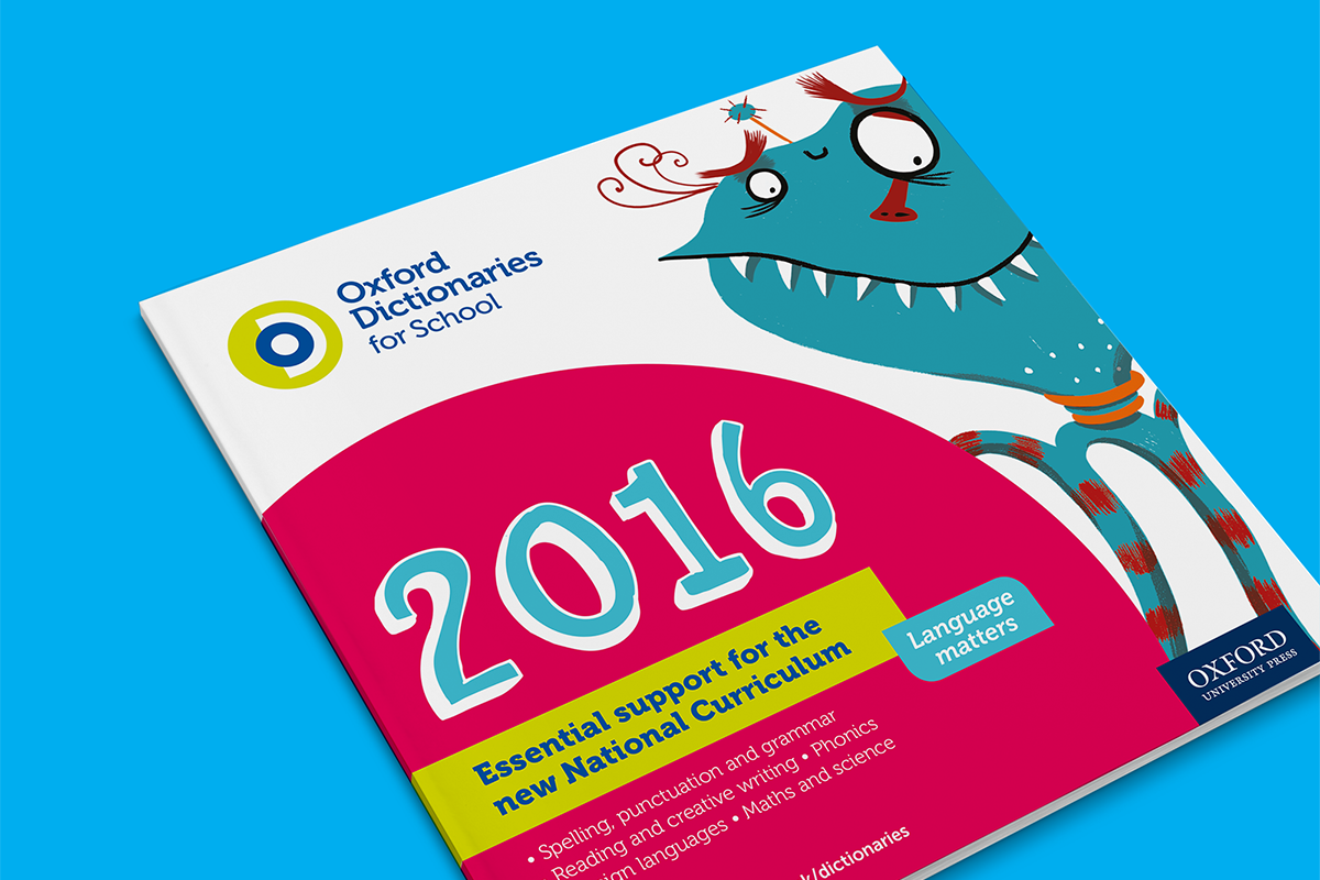
We were thrilled to design the brand identity and a unified marketing style to promote Oxford Dictionaries (OUP) schools' and children's product range.
Logo and Graphic Style
The logo uses the combined initials to create a bold and recognisable monogram. It was important for the overall style to be modern, yet also communicate the authority and depth of the product range.
Guidelines Document
The interactive guidelines document contained extensive design elements to ensure consistent application of the identity.


